The Canadian Army has unveiled their revamped branding.
Credit: Canadian Army
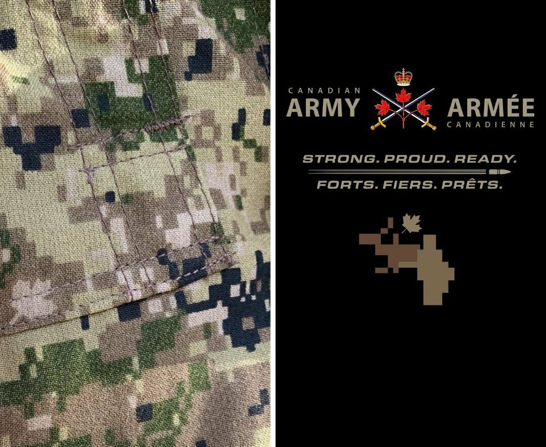
The newly introduced branding incorporates the Canadian Army badge (a crown, two crossed swords, and three red maple leaves on one stem) and the tagline “Strong. Proud. Ready.” Below the tagline is a pixelated image and a maple leaf.
“Introducing a new icon and refreshed tagline for the Canadian Army, featuring the new CADPAT MT (Multi-Terrain) pattern, ” stated the Canadian Army on their social media pages.
“It is designed to complement our official Canadian Army logo.”
According to the website, Defence Research and Development Canada (DRDC) played a crucial role in developing the new CADPAT MT pattern. Utilizing specialized software, DRDC analyzed digital photographs from various operating environments. This software pixelated the images and calculated the percentage of each colour and texture present in the environment. Subsequently, this data informed the creation of the new Multi-Terrain (MT) pattern.
Introducing a new icon and refreshed tagline for the Canadian Army, featuring the new CADPAT MT (Multi-Terrain) pattern.
It is designed to complement our official Canadian Army logo.
To discover more about the CADPAT MT, follow this link: https://t.co/Q8i5lhNxeK pic.twitter.com/5ve3ZpEUGM
— Canadian Army (@CanadianArmy) May 3, 2024
The present Canadian Army Badge, which was approved in 2016, represents: “The crossed swords symbolize the military history of the Canadian Army. They also indicate that the members of the Canadian Army work as a team in the defence of Canada. The three maple leaves conjoined on one stem, taken from the Royal Arms of Canada, represent service to the Sovereign and to Canada, as well as the heritage of the Canadian Army. The Royal Crown signifies service to the Sovereign.”
The Canadian Army has not elaborated on the pixelated image, which looks like an animal from the cervid species like deer, moose, and caribou.


